
Meet ONEWORLD
"The ultimate equalizer. It gives a voice and a platform to anyone willing to engage"

ABOUT
One world is an app that chronologically presents different articles with content related to the LGBTQ community, such as: events, news, laws, health and educational topics. Allowing users to write their own articles.
OBJECTIVE
Focus on the information that is missing from other common platforms, especially educational articles that can promote equality and respect, also the development of a solid community.
ROLE
I was brought to this project to understand user's needs and pain points to be able to build and create the best solution through our research and design process.
And as a social contribution, understand the community, support and mainly provide the knowledge of educational topics that aim to contribute and protect communities that are often isolated.

BENCHMARK
We begin this process with a competitive analysis to better understand the habits and preferences of the community. In this analysis we take into account well-known brands such as Out, GiB, Vice, VanityFair, and we analyse several of the metrics that we consider most important as:
-Website content
-Visual design
-Website sections
-Type of content
-Article structure
-Readers type
and thus be able to understand our next target.

We observe that the focus is mostly on: pop news, fashion and beauty trends, social and political reports, often controversial.
This helped us to question the lack of content, especially in regional news, educational topics, forums and community to share articles.
This helped us to question the lack of content, especially in regional news, educational topics, forums and community to share articles.
SURVEY
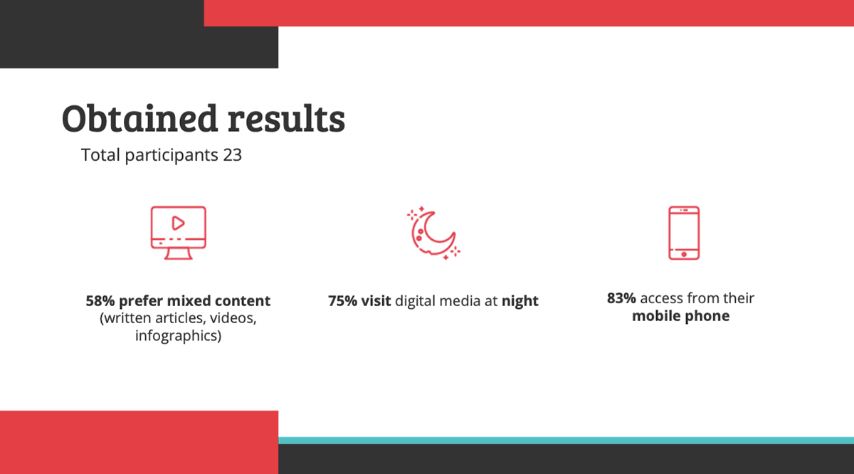
A survey with 23 people in the age range of 25 - 35 years old who are part of the LGBTQ community. The questions covered general information such as preference, decision making and frustrations during online research, I collected responses in the form of multiple choice and short answers to get more insights at an early stage.
SURVEYS STATISTICS


USER INTERVIEWS INSIGHTS


USER PERSONA
I Analysed and synthesized existing research by adding notes, data, observations, and feedback, and creating key insights, nuggets and findings, to have a clear understanding of who my target user will be and created a user persona.

To uncover areas of opportunities a user journey map will help me visualize the steps users take in order to accomplish a goal. During the process, I will analyze each step and see where the opportunity lies and how the user experience can be optimized.
USER JOURNEY

USER STORIES
Creating user stories I get a brief statement that identifies the user and describes their core needs.


Brainstorming Ideas
From HMW statement the main ideas were generated. The goal here is to be able to cover every aspect of the problem and find a significant solution.
We did our ideation process through the Crazy Eight's technique where each member gave their ideas, and together the following proposal was reached.

LOW-FIDELITY WIREFRAMES

SITEMAP
After understanding the priorities of the site is important to recognize the relationship between pages, and the organization, navigation, and labeling found in the site.

USER FLOW
To understand how the users are going to interact and perform the tasks, I created a user flow.


MIDFIDELITY WIREFRAMES


USABILITY TEST
We did our usability test. We had the participation of 9 testers, who had to execute 2 tasks:
1) Write an article
2) Read and share an article

LEARN & ITERATE
From the usability test results we were able to change and modify these 2 things.
• Modify "Send an article" with "Write an article" since the users were confused about those functionalities.
• Enlarge the icons of social networks inside the articles, and add the title "Share with ..." since users found it hard to see the option

STYLE GUIDE
Once we defined the structure of our screens, we started with the brand's logo, using pastel colors referring to some colors of the community, we avoided using all of them to circumvent the weight in the design.
For the typography we use Roboto Slab for the titles, is a free font, comes in 12 different styles, makes multiple appearances and goes well with Open Sans that we use for the bodies.
The icons were designed in an outline style, with the main color of the brand, with a minimum size of 24px and a touch area of 48px.
The icons were designed in an outline style, with the main color of the brand, with a minimum size of 24px and a touch area of 48px.


UI SCREENS

Desktop


Tablet

Mobile


NEXT STEPS
• Develop the dark mode for the app
• Develop our desktop and tablet browser


